Little Lemon
Project Overview: As part of the Meta Principles of UX/UI Design course, I designed Little Lemon’s table reservation system to make booking faster and easier. I focused on simplifying the user journey, improving form clarity, and ensuring a smooth experience across devices.
Timeline: April 2025
Role: Product Designer
Tools/Methods: Figma, Wireframing, Prototyping, User Persona Development, Journey Mapping

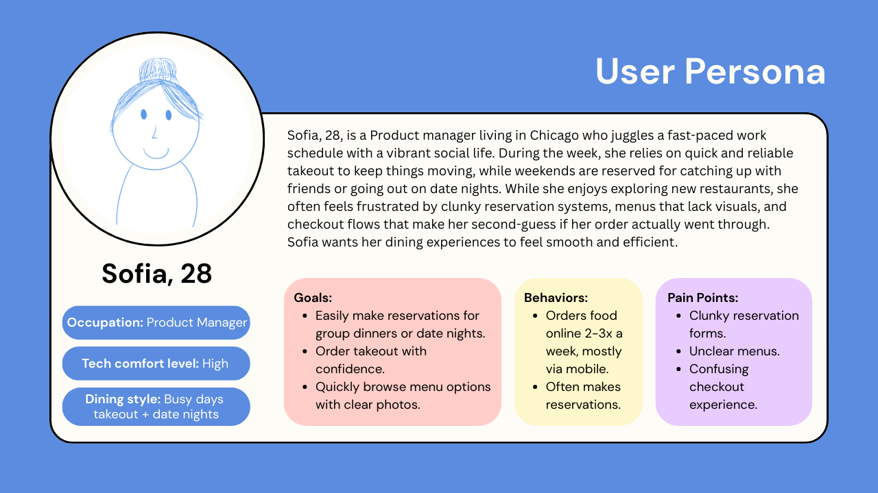
Empathizing With Users
To guide my design decisions, I created a fictional user persona that represents a typical Little Lemon customer and highlights key goals, behaviors, and pain points around dining and ordering experiences.
Low Fidelity Wireframes
1) Ordering Delivery
This set of low-fidelity wireframes outlines the core user flow for ordering from Little Lemon: browsing the homepage, selecting an item, adding it to the cart, and completing checkout. These wireframes focus on building a smooth, minimal experience that eliminates confusion during key moments like customization and payment.

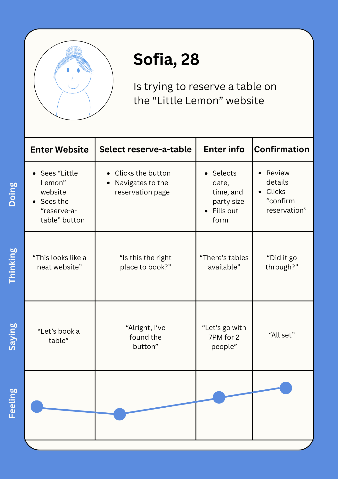
This set of low-fidelity wireframes illustrates the full table reservation process for Little Lemon, guiding users step-by-step from initiation to confirmation. This simplified flow was designed to remove friction from the reservation experience and ensure users feel confident every step of the way.
2) Reserving a Table

High Fidelity Prototypes
1) Ordering Delivery
This high-fidelity prototype maps the full delivery process, from browsing to order confirmation. Users can easily navigate menu categories, view detailed item pages with add-ons and delivery times, and build their order with clear customization options. The cart and checkout pages streamline the summary and encourage add-ons, while the confirmation screen provides reassurance with clear totals and timing. The flow improves transparency, reduces confusion, and creates a smoother ordering experience.

2) Reserving a Table
The high-fidelity prototype refines the table reservation experience into a clean, step-by-step process that emphasizes clarity, ease of use, and visual warmth. Starting with a welcoming intro screen, users are guided through selecting the number of guests, picking a date and time, entering reservation details, and confirming the booking. This prototype directly addresses earlier user pain points around confusion, uncertainty, and form complexity by offering a smooth, reassuring, and user-friendly flow from start to finish.

Key Takeaways
Clarity and control are essential – users want clear customization options, transparent pricing, and delivery time upfront to feel confident placing an order.
Step-by-step flows reduce friction — breaking the ordering and reservation process into simple, visual stages made navigation more intuitive and less overwhelming.
Design influences trust — a friendly, cohesive visual style helps users feel more secure and reassured throughout the checkout and booking experience.