Walmart Redesign
Project Overview: In this self-initiated project, I focused on updating Walmart’s visual identity and online experience to better connect with today’s users. I created a new logo and slogan, then redesigned the website with a more organized layout, and a refreshed brand tone that feels both current and approachable.
Timeline: February 2025
Role: Product Designer
Role: Figma, Wireframing, Prototyping, Storyboarding, Persona Development

Empathizing With Users
To guide my design decisions, I created a fictional user persona that represents a typical Gen Z customer and highlights key goals, behaviors, and pain points around using the Walmart website.

This led me to my guiding “How Might We” questions:
How might we help Jordan quickly discover trendy, affordable items without feeling overwhelmed by cluttered layouts?
How might we design a web-first experience that feels intuitive, modern, and aligned with Gen Z browsing habits?
How might we surface Gen Z-relevant products through personalized visuals rather than relying on search-based discovery?
Due to the conceptual nature of this redesign, I based my design decisions on Gen Z shopping trends and a fictional persona representative of Walmart’s evolving user base.
Storyboarding

Low Fidelity Wireframes
Using paper, I sketched the first set of low-fidelity wireframes focusing on two key areas: the homepage and the Campus Trends section. The homepage highlights seasonal promotions and trending items to immediately engage Gen Z users with visually rich, scrollable content. The Campus Trends pag is broken into intuitive categories like tops, bottoms, and accessories, allowing users to browse by style with minimal friction. I included interactive buttons and horizontal scrolling to support a mobile-first experience and mimic the swipe-based navigation familiar to Gen Z. This lo-fi phase helped prioritize whitespace, clear categories, and interactive elements before moving into digital wireframing.

High Fidelity Prototype
The color palette uses warm, muted tones to create a calm, inviting atmosphere that feels fresh and Gen Z-friendly.
The typography brings modern structure with a clean, editorial feel. Instrument Sans is used throughout the site for body text and UI elements, while Instrument Serif adds contrast and personality to large titles and key headings.

The high-fidelity prototypes address key user pain points by decluttering Walmart’s original interface and introducing a cleaner, more visual shopping experience. Product categories like Campus Trends are clearly separated with bold headings and consistent card layouts, making it easier for Gen Z users to browse without feeling overwhelmed. Improved hierarchy, simplified navigation, and curated visuals support quicker decision-making and a more enjoyable shopping flow.
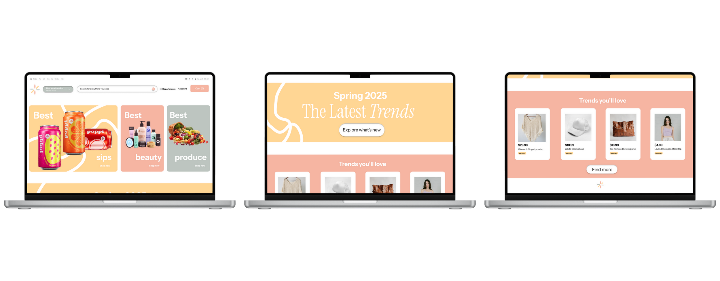
1) Homepage

2) Campus Trends
Key Takeaways
Gen Z expects clarity and speed — visual clutter and dense layouts reduce engagement, while clean, curated content encourages exploration.
Structure matters — organizing products into scrollable, visually-driven sections helps users browse more efficiently and discover relevant items faster.
Visual tone impacts perception — soft colors, modern typography, and thoughtful use of whitespace significantly improved the usability and appeal of Walmart’s interface for a younger audience.